As we’re making progress on my new album, Distorted Vision — about which I’ll have more to say in the future — I thought some folks might be interested to see how the cover of Truths and Lies and Make-Believe came about. Just as I could not have recorded the album by myself, I could not have put the cover together without the help of some very skilled people!
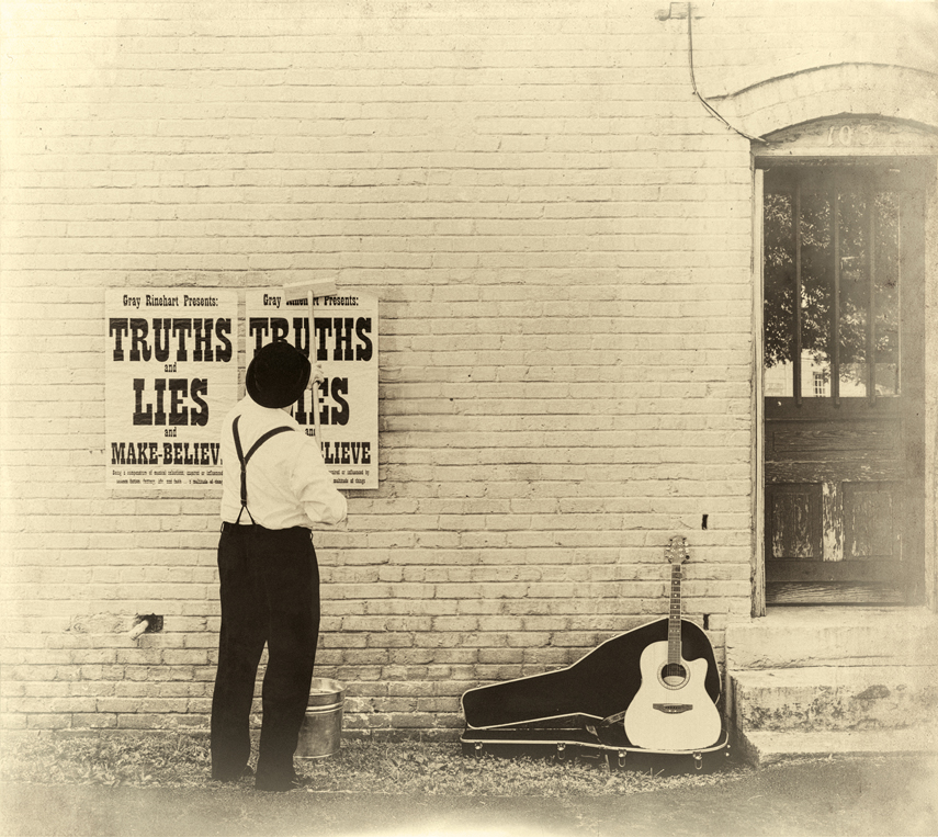
First, here’s my original idea of what I wanted the cover to look like:
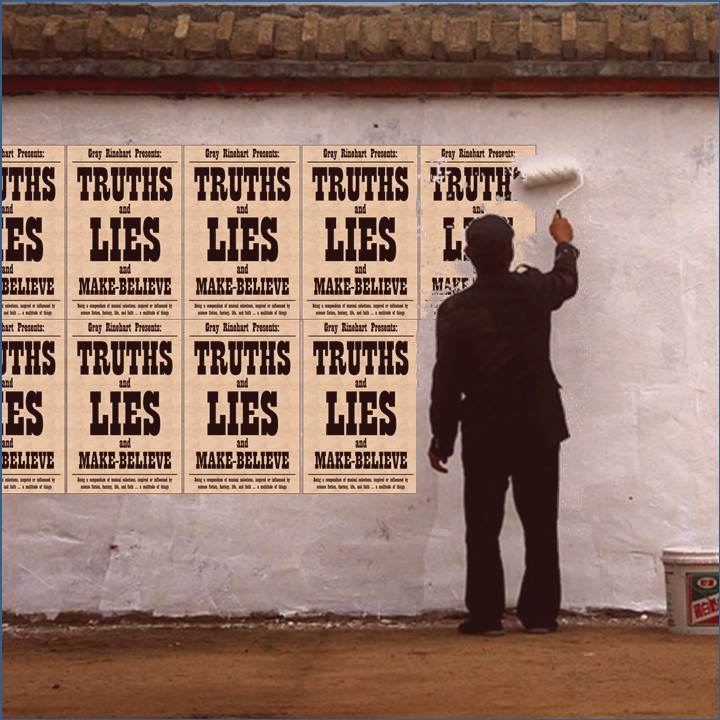
I made that image on PowerPoint, using a picture I found on the Internet and the poster idea I’d first used in flyers for the album. I wanted an old-timey feel to it, and something about the idea of putting up notices appealed to me. Eventually, instead of trying to do two rows of posters I decided to use a single row — primarily because it was less work!
With the concept in mind, I drove around town looking for different places where we might stage the scene. I found several candidate walls in wood and cement and brick, and talked to nearby vendors about whether we could put up posters on them. Ultimately I got permission from the Creative Images trophy and sign shop to use the wall and doorway on the side of their building.
I went frugal with the posters: I printed them at Staples in a couple of different sizes to see what would work, then had enough printed for the photo shoot. They were printed on white paper that I “antiqued” with tea — specifically, a mix of black tea and some raspberry tea for a little reddish tint. (The tint comes through a little on the color versions of the photos — you can see a few of them on my web site.) To hang the posters, I mixed up batches of wheatpaste from a recipe I found on the web.
My photographer for the day was Paul Cory, who had recruited several ladies to be passers-by and observers in the pictures of me putting up the posters. I had recruited my daughter Stephanie as well, and in addition to her we had a lady Jedi, a “steampunk pirate,” and the comic book character The Question. You can see them on the inside of the CD cover, like this:
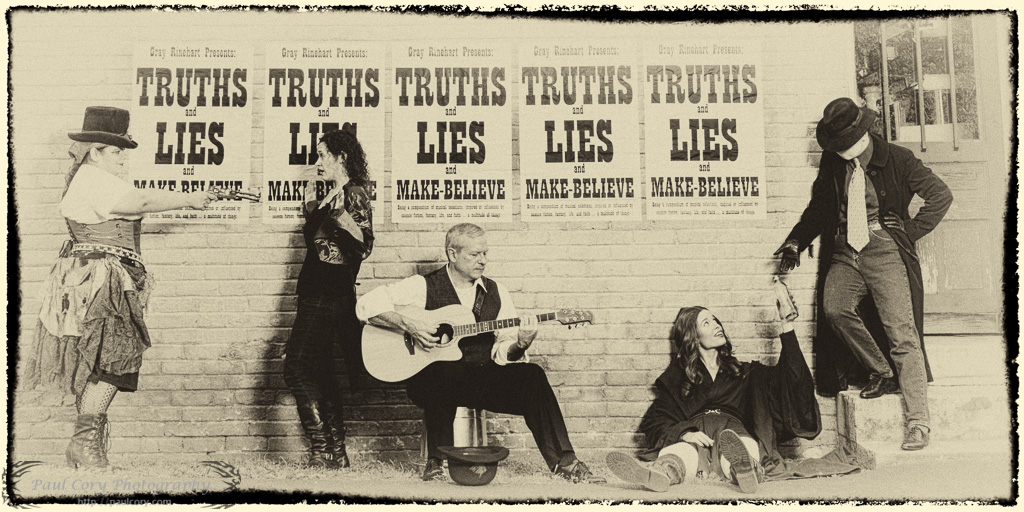
The original color version of that image, without the “postcard” effect, is one of the backgrounds on my web site.
Here’s the final cover design, as put together by my son Christopher:
I think it turned out to be a great realization of my original concept. And I very much appreciate everyone who helped make it a reality!
You can see all the cover images, inside and outside, on the album’s Bandcamp page.
___
P.S. I adapted this blog post from an article sent previously to my newsletter subscribers. If you’d like to receive my every-so-often newsletter, fill out the form here.